Mobile Paywall
Invoice Simple
Subscription paywalls serve a key role in establishing trust with users by outlining crucial information such as feature packages, pricing and promotions. Working with a product manager and an engineer, I led a complete redesign of the Invoice Simple paywall to streamline our buyer experience.
Role: Lead product designer
Platforms: Mobile (iOS & Android)
Result: Grew purchase conversion by 18%

Context
Invoice Simple's business objectives included the delivery of enhancements to the new user journey. A funnel study identified a “paywall to purchase” drop-off as a pivotal opportunity.
Buyer Bottleneck
Prior to the redesign, the paywall emphasized introducing new users to Invoice Simple rather than presenting subscription plan details.
Consequently, we hypothesized that space was being put to waste by “reselling” our product to users already familiar with it.
Scrolling, not Seeing
Users needed to scroll past a value proposition section followed by testimonials before seeing any information about paid plans.

Inefficient Presentation
The previous organization of subscription plans and their respective feature lists made it difficult to make comparisons between different tiers.

Design Solution
By reworking visual design and restructuring information hierarchy, we sought to deliver an experience that helps users decide which Invoice Simple plan best fulfills their business needs.
The new paywall design is grounded upon three following principles:
- Simplicity
Avoid using large bodies of text
- Progressive disclosure
Introduce details incrementally
- Transparency
Arrange information for easy consumption
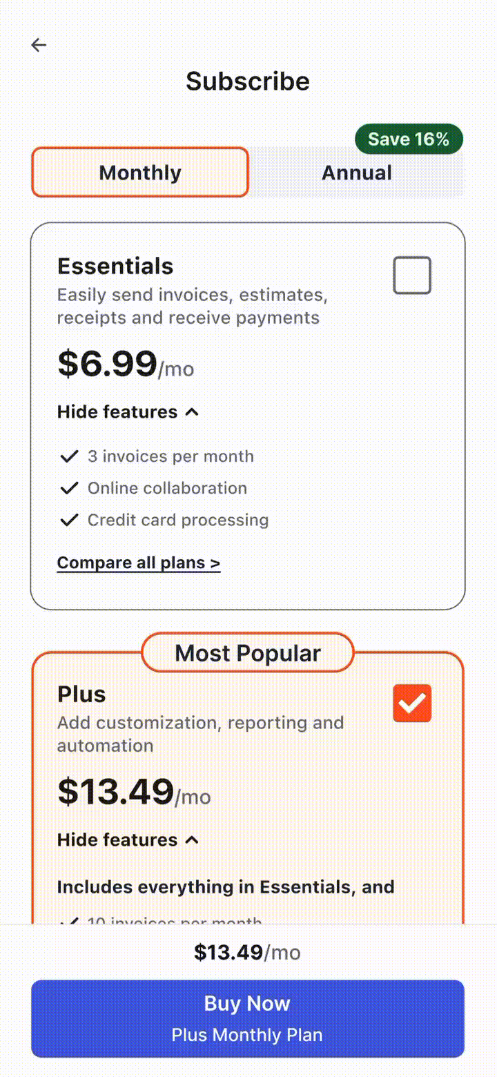
Reorganized Layout
Refinements were driven primarily by two variables: plan type, and plan duration. Paginating by duration enables users to compare subscription tiers side-by-side.

Collapsible Cards
Surfacing critical information while minimizing bloat proved to be a delicate balance to attain. Collapsible cards display a short summary of each plan and provide the option for users to see its associated features.

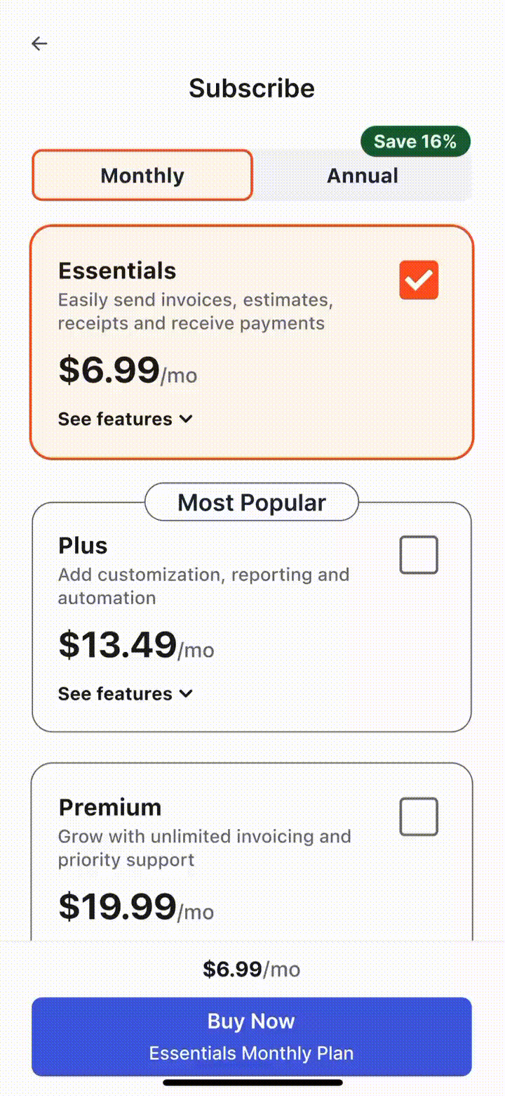
Tracked Selection
A bottom-fixed call-to-action (CTA) enables users to scroll through the paywall without losing track of their selected subscription plan. This is a strength of the previous paywall we opted to preserve and improve upon.

Validation & Results
An A/B test was run to quantitatively validate the new paywall design. We successfully addressed the user funnel drop-off by growing key business metrics and uncovering further opportunities.