Paywall Redesign
Invoice SimpleSubscription paywalls serve a key role in establishing trust with users by outlining crucial information such as feature packages, pricing and promotions. Working with another designer, a product manager and an engineer, I led an end-to-end redesign of the Invoice Simple paywall to streamline our buyer experience.
- Role
- Lead product designer
- Platform
- Mobile
- Duration
- 2 months

Result
The redesigned paywall addressed a major acquisition funnel drop-off by making it easier for buyers to learn about our subscription offerings.
Problems
Prior to the redesign, the paywall emphasized introducing new users to Invoice Simple rather than presenting subscription plan details.
Consequently, we hypothesized that space was being put to waste by “reselling” our product to users already familiar with it.
Scrolling before Seeing
Users had to scroll through value propositions and testimonials before seeing any information about paid plans.
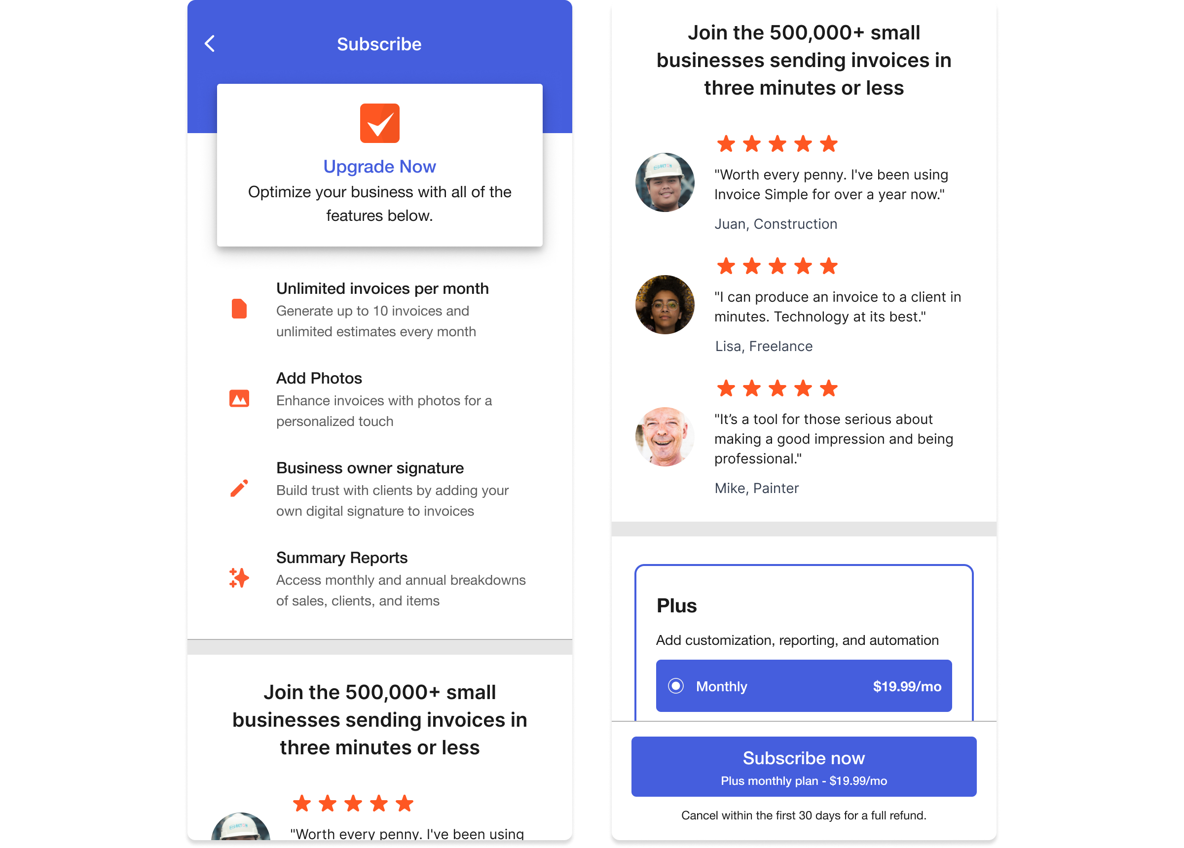
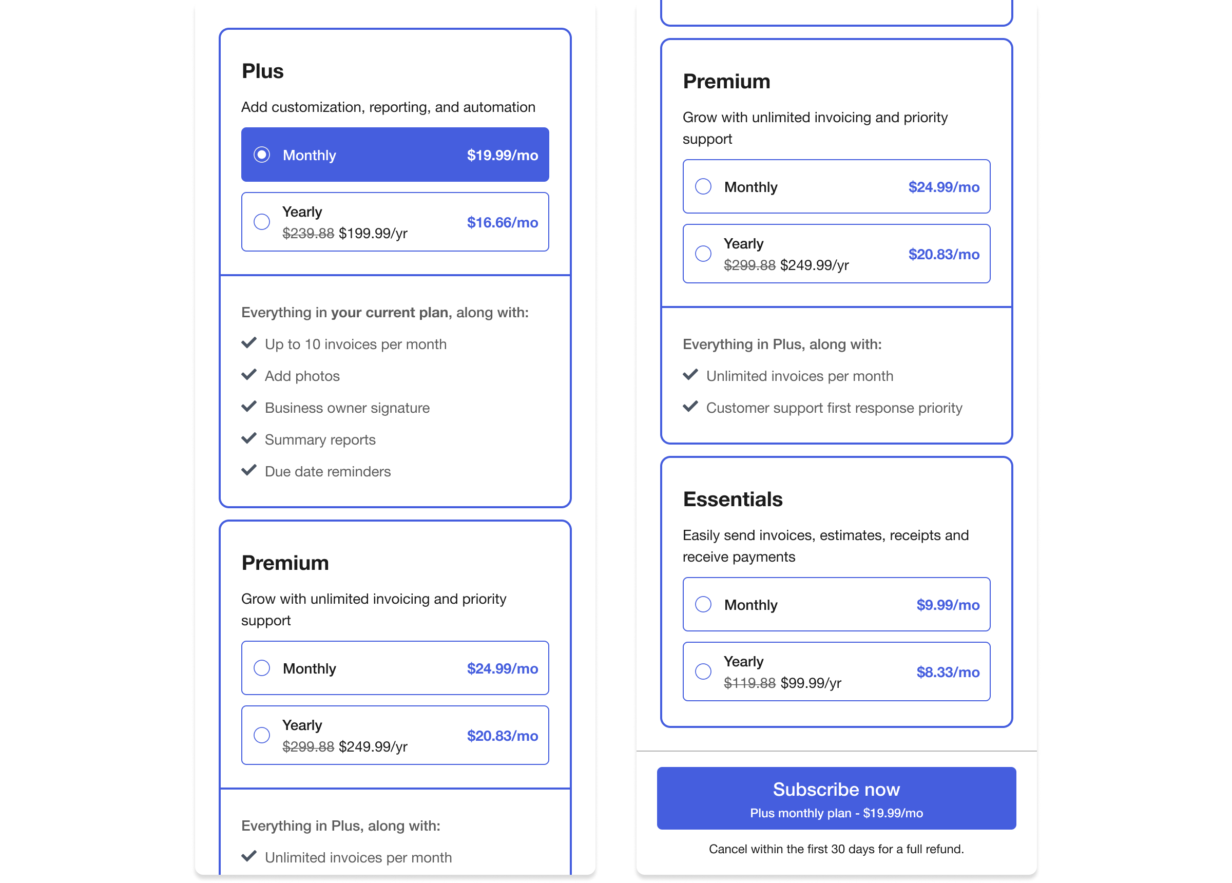
Overwhelming Presentation
The previous organization of subscription plans and their respective feature lists made it difficult to make comparisons between different tiers.
Research
I studied subscription paywalls from leading mobile apps and identified patterns utilized consistently across the strongest examples.
- Straight to the point
Minimalism is leveraged by leading with plan details and omitting lengthy hero sections.
- Plans arranged as cards
Cards make it easy to identify and compare tiered subscriptions.
- What you see is what you get
Laying out plan options at a glance minimizes the navigation required to make comparisons between offerings.
Design Solution
By reworking visual design and information hierarchy, I sought to deliver an experience that helps users decide which Invoice Simple plan best fulfills their business needs.
The new paywall design is grounded upon three principles:
- Simplicity
Avoid using large bodies of text.
- Scannability
Arrange information for easy consumption.
- Progressive disclosure
Introduce details incrementally.
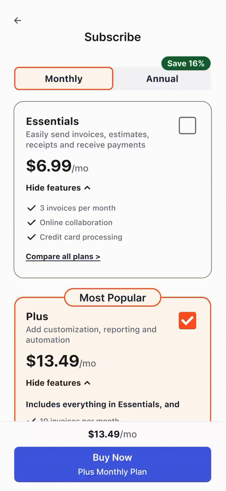
Reorganized Layout
Refinements were driven primarily by two variables: plan type and plan duration. Paginating by duration enables users to compare subscription tiers side by side.
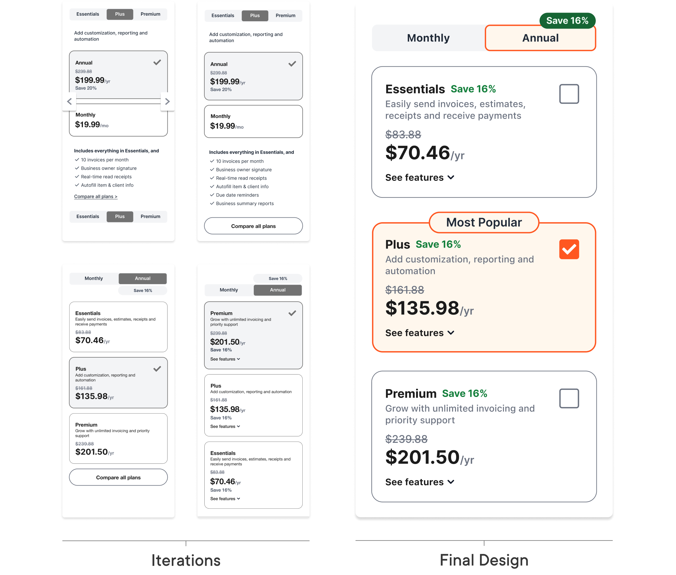
Collapsible Cards
Surfacing critical information while minimizing bloat proved to be a delicate balance to attain. Collapsible cards display a short summary of each plan and provide the option for users to see its associated features.

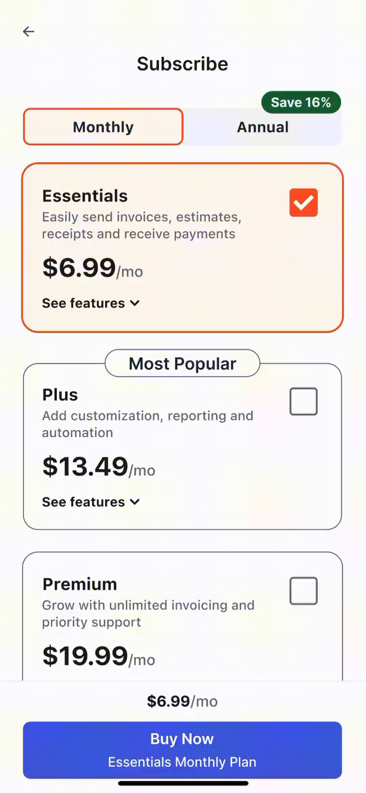
Tracked Selection
A bottom-fixed call-to-action (CTA) enables users to scroll through the paywall without losing track of their selected subscription plan. This is a strength of the previous paywall we opted to preserve and improve upon.

Next Step
Extend redesign to feature list
This initiative prioritized the information presented within the user's immediate viewport—the top of the paywall. Hence, the next opportunity entails revisiting the design of our feature list to serve the user goal of comparing subscription plans.