Pick History
Loblaw DigitalThe pick history is used to validate the fulfillment statuses of thousands of customer orders every week. It is used in the day-to-day operations of PC Express (PCX), Loblaw's click-and-collect and delivery service. With another designer, six developers and a product owner, I led its complete rebuild from discovery to delivery.
- Role
- Lead product designer
- Platform
- Desktop
- Duration
- 3 months
Outcome
Context
With COVID-19 driving demand for online grocery services through the roof, Loblaw looked to enhance the usability of their internal operations platform, better known as the Ops Portal.
The Previous Module
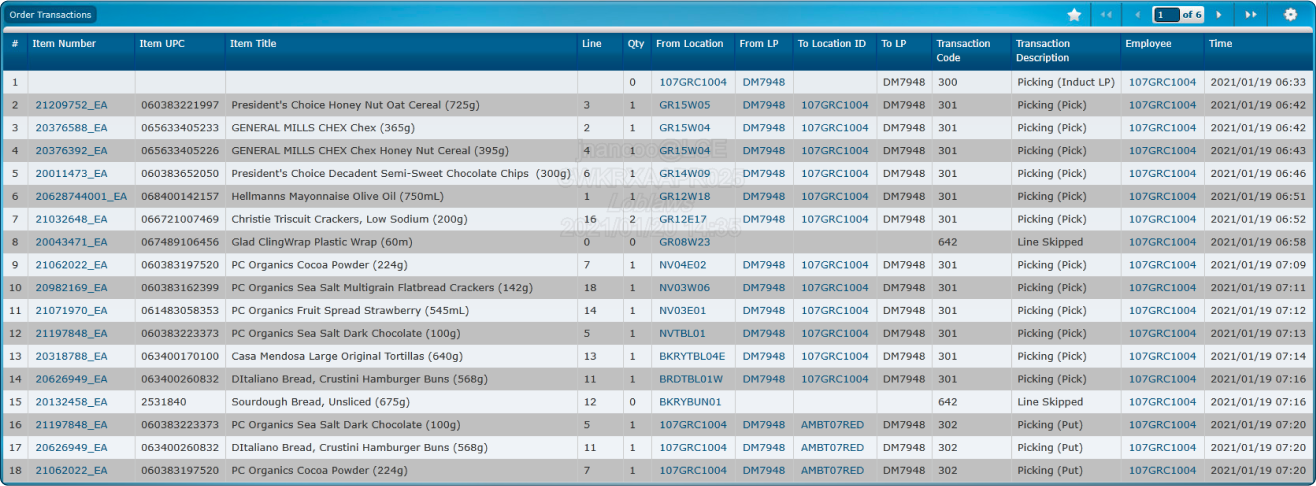
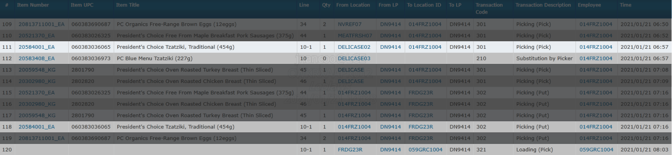
The transaction log—referred to as TRX—was a key element of the previous operations platform. It recorded every task performed by store colleagues (also known as PCX specialists) throughout the preparation process of a customer order.
Through the details presented by “transaction” entries, specialists were able to validate orders by:
Pinpointing substituted or unfulfilled items
Following up with pickers regarding any given task or status
Verifying staging and loading times
Log Interface
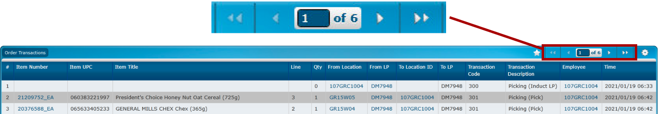
Transactions were paginated and sorted earliest-first.
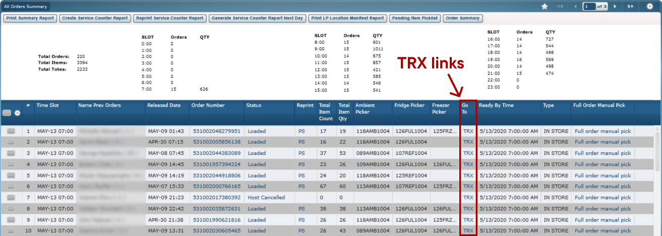
Entry Point
Logs were attached to every order within the previous platform's “All Orders Summary” page.
Problems Uncovered
My first few weeks on this project were spent learning about our problem space. I took an in-depth look at the end-to-end journey of an online grocery order and the role served by TRX within the PCX ecosystem.
Ambiguous Information
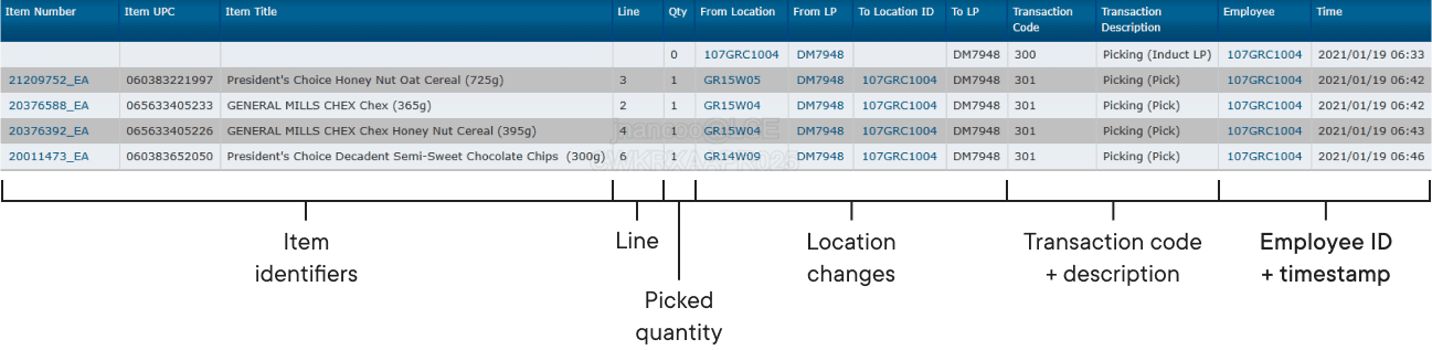
Location changes and transaction descriptions were presented as raw, tabulated data in the form of numbers.
Tedious Item Tracking
Transaction codes represented the different stages of the pick lifecycle and were paired with a very short description.
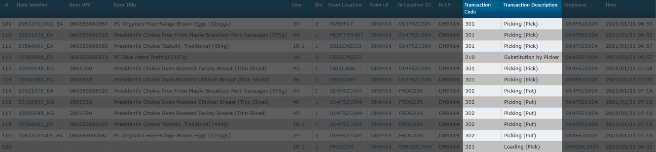
Entries connected to the same item journey were ungrouped and tracked by cross-referencing with their “Line” property.
Laborious Navigation
Transaction logs for larger orders could span over 15 pages in length—navigation interactions were limited to two sets of “Next” and “Previous” buttons.
Design Approach
After uncovering problems with TRX, we outlined three areas for a new design to innovate in:
- Clarity
Leverage natural language to make transactions easier to understand
- Cohesiveness
Simplify item tracking by connecting transactions of the same journey(s)
- Scalability
Enhance navigation by enabling it to adapt to varying order sizes
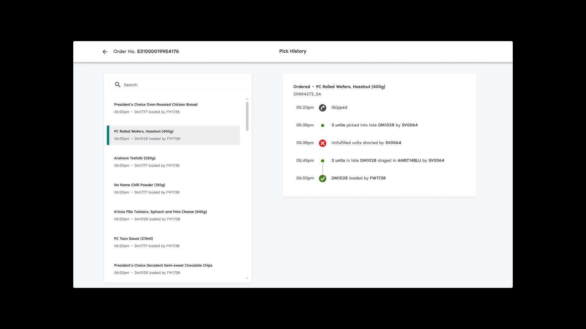
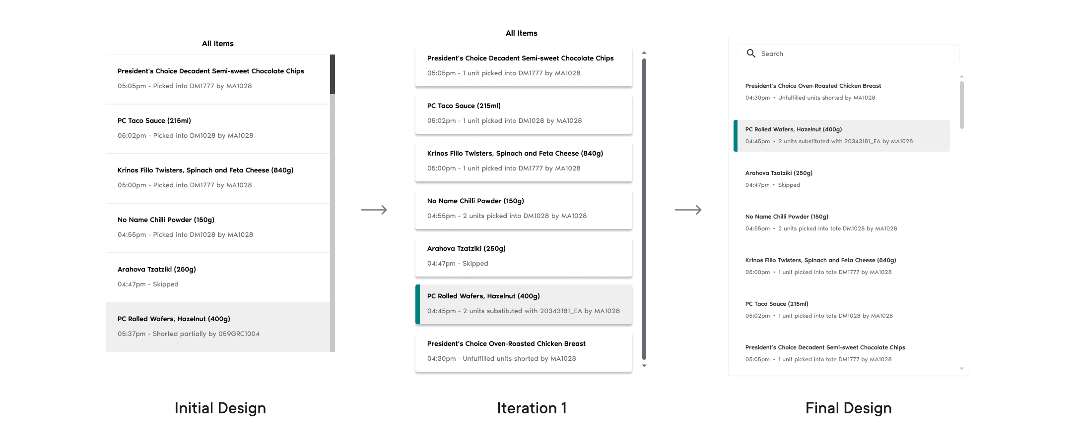
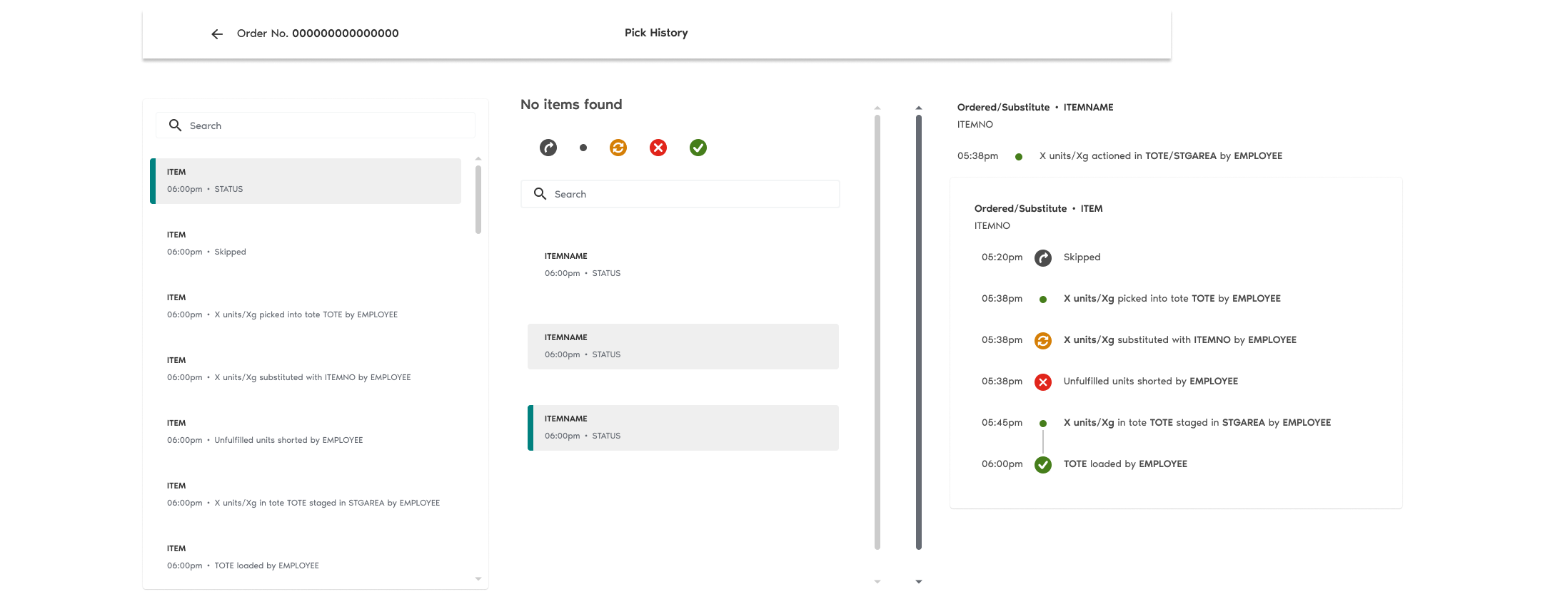
New Interface Layout
I elected to split up the pick history layout into two layers of information: the transaction level and the item level.
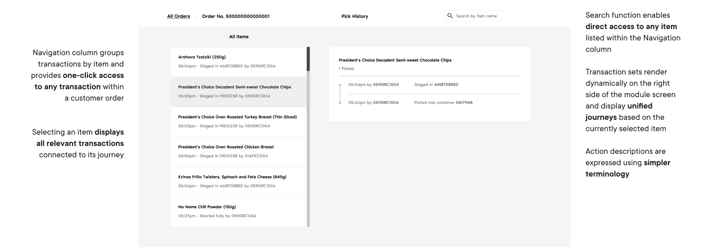
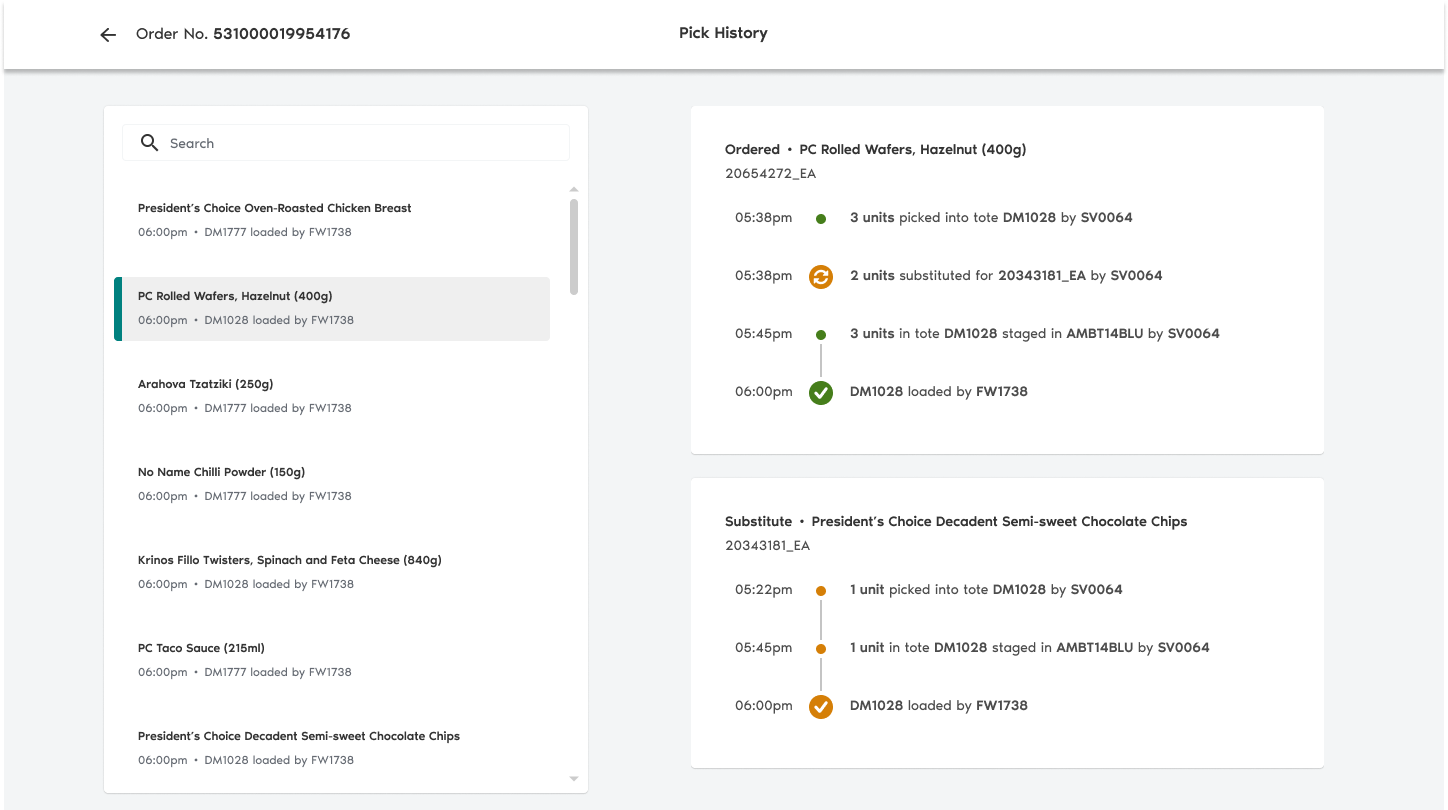
Unified Item Journey
To streamline item tracking, I grouped transactions based on the items they belong to. Each transaction set is sorted latest-first so that the most “current” state of each item is available to users upfront.
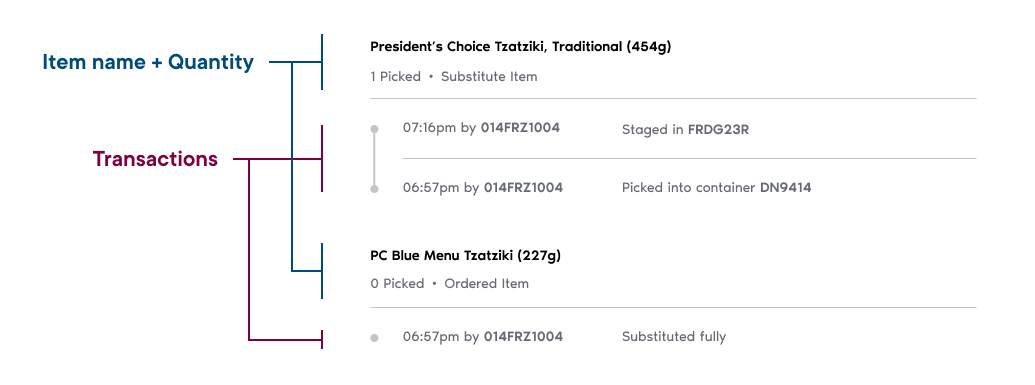
Surfaced Item Status
A navigation column facilitates one-click access to any transaction regardless of how many items are present within an order log. Additionally, cards provide insight into an item's latest status without the need to select it.
New Search Function
Colleagues will often go into TRX knowing exactly which items they want to look into. We introduced a search function to enable access to these items without the need for too much scrolling.
Usability Testing
I had five PCX specialists validate orders using an interactive prototype.
✅ Strengths
Action descriptions were easy to understand
Statuses took less time to verify
Reworked navigation yielded quicker timestamp confirmation
💡 Opportunities
Make different action types more distinguishable
Refine the visual presentation of item substitutions
Utilize chronological transaction sequencing to better match user mental model
Refinements
My approach to polishing our solution encompassed two core foundations:
A continuous stream of feedback from store colleagues
Close collaboration with developers to preserve alignment on technical feasibility
Transaction Card Iterations
Refining the transaction cards presented the challenge of illustrating complex item journeys without adding too much clutter to the interface.
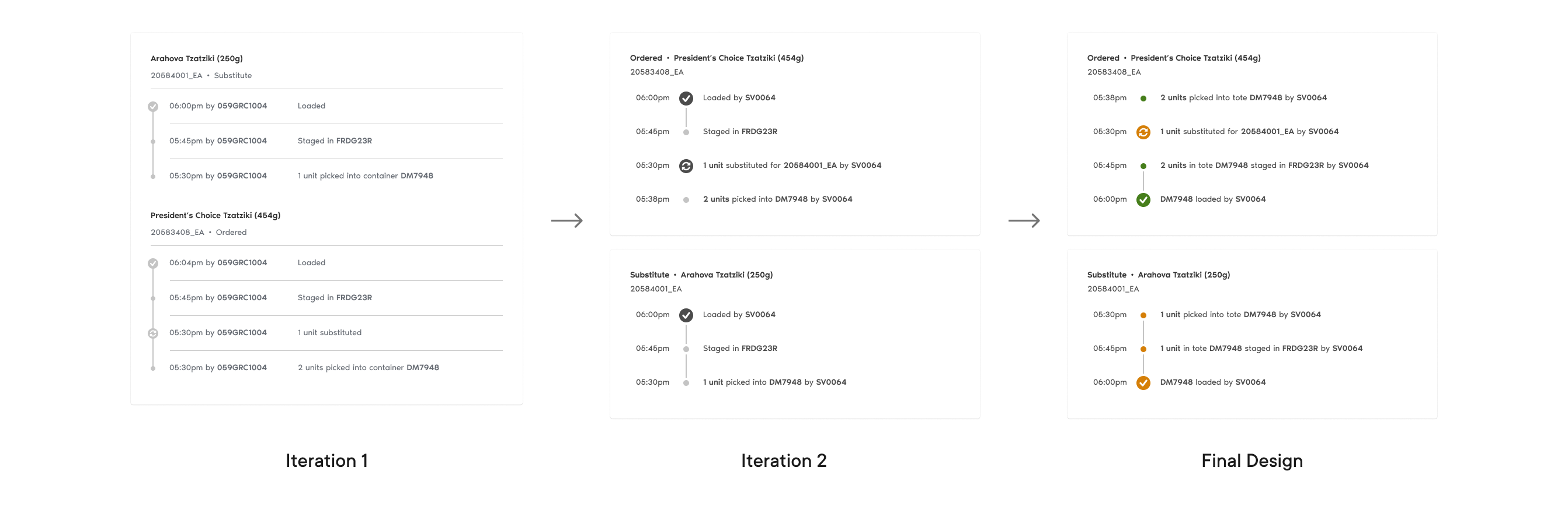
Navigation Column Iterations
Maximizing the number of viewport-visible items while surfacing important status information was key in delivering the navigation design.
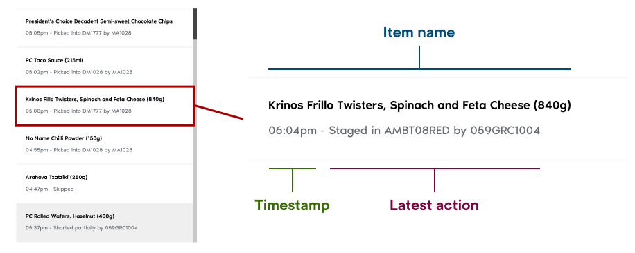
New Visual Elements
Upon iterating our transaction designs, I opted to capitalize on iconography and colour—domains untouched by both TRX and the pick history's initial design prior to testing.
“[An icon] is Worth a Thousand Words”
In adherence to a classic aphorism, timeline icons serve as indicators for transactions that fall outside of the expected pick actions.
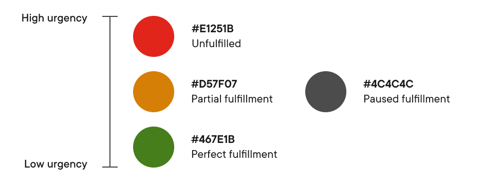
Traffic Light Colour Sequence
A traffic light colour system classifies transactions based on the levels of fulfillment they contribute to the customer order.
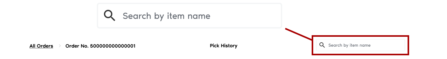
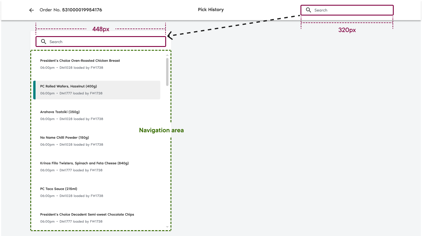
Contextualized Search
It was confirmed later along our project roadmap that the search function within our new module would be contextualized to each individual order.
This opened opportunities for me to make changes that better facilitate successive search queries.
If it Fitts', it Ships
The search bar was made wider and relocated into our navigation column—closer to where other user interactions would take place.
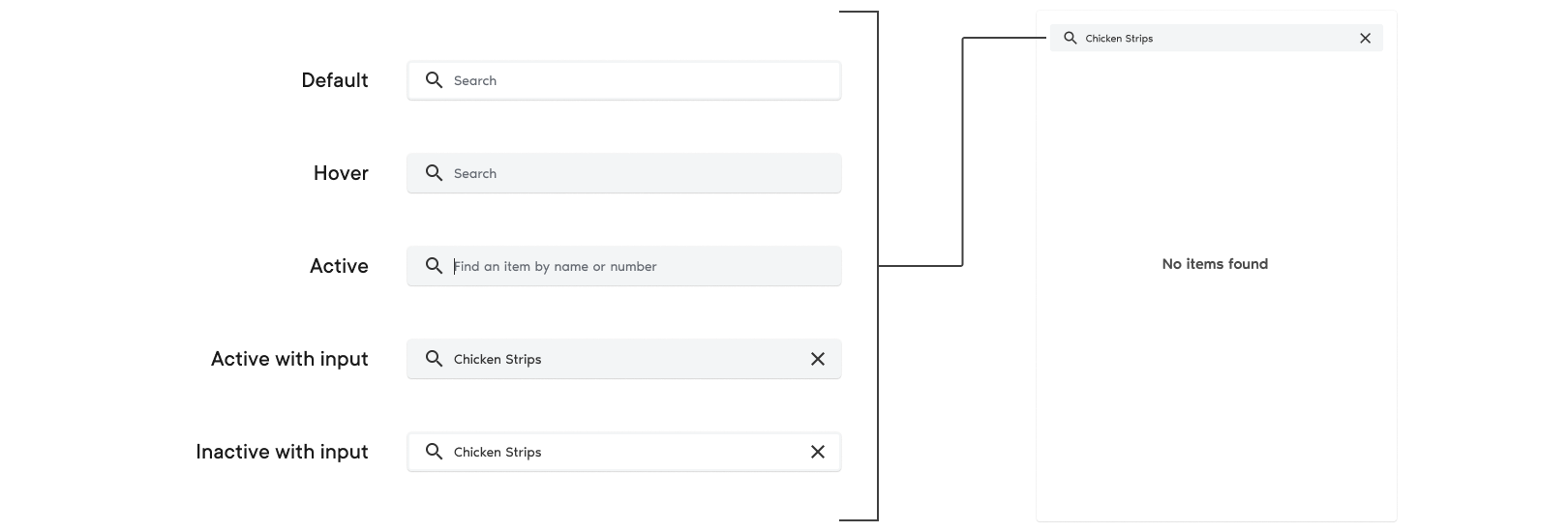
Microcopy that Teaches
The final search bar's states incorporate helper text that informs new colleagues about what they can use the search function for.
Handoff and Launch
During the closing phases of the transformation project, I constructed a pattern library to serve as the single source of truth during the development of the Pick History's frontend components.
Pattern Library
Components have been styled in accordance with the PCX design system.
Launch-Ready Design
We presented our final design at the Ops Roundup, a weekly forum attended by colleagues from the wider PCX operations branch.
Next Steps
Capture post-launch user feedback
Some design opportunities don't reveal themselves until after a product undergoes extensive unmoderated usage. Getting the Ops Portal into the hands of stores opens up a wider pool of users to collect feedback from, and in turn a wider pool of unseen insights.
Explore a potential merger with another Ops Portal component
Colleagues refer to an Order Details page to check ordered item quantities—a key piece of information missing from the pick history. I would study the feasibility of consolidating the data provided across both components to create a unified investigation tool.
Reflection
Driving form with function
Every creation or change throughout the project—from palette changes to reformed interactions—was driven by an intended function or goal, ensuring that every decision made was informed.
Observing, not just listening
Watching users carry out tasks in real time reveals crucial aspects of the decision-making process behind how they work towards objectives. Usability testing confirmed the importance of readability in how quickly PCX specialists can validate orders and in turn streamline fulfillment operations.
Embracing ambiguity
Taking ownership of the pick history design instilled me with confidence in my ability to navigate ambiguity and taught me about the importance of seeking context in solving a problem. TRX presented a simple-looking interface that belied a complex layer of information—one I came to understand by learning about how PCX operates.